
Only 1 in 8 A/B tests produces a statistically significant change. That number explains why most conversion rate optimization programs stall. The problem isn’t execution. It’s test selection. Most teams run the same six tests every blog recommends, in no particular order, with no framework for which landing page optimization decisions will actually compound. This article covers the seven tests that do, ranked by real-world win rate data, not theoretical potential.
Why Most A/B Tests Return Nothing
The most expensive A/B testing mistake is invisible. You set up the test correctly, split the traffic, and reach statistical significance. The result is inconclusive. You shrug, pick a winner based on instinct, and move on.
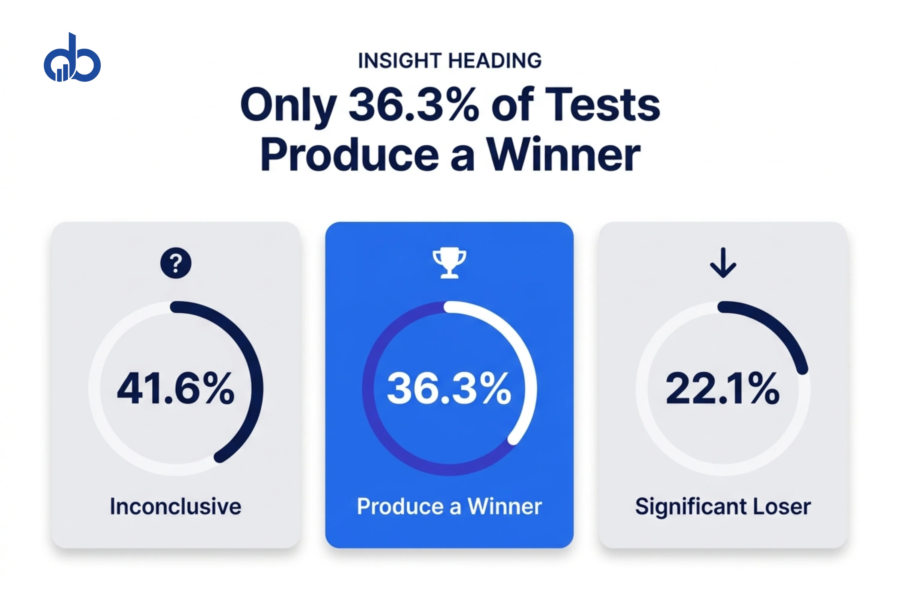
41.6% of A/B tests are inconclusive. Another 22.1% produce a statistically significant loser. Only 36.3% produce a winner. And that assumes you ran the right test to begin with.
Not all tests are equal. DRIP Agency’s analysis of more than 1,000 experiments across 91 e-commerce brands found that win rates vary dramatically by test type. Popup and FOMO/scarcity tests win between 47.8% and 72% of the time. Navigation and layout tests win only 28.2% of the time.
Most conversion rate optimization guides never tell you this. They list seven things you could test and present them as equally valuable. They’re not. Which test you run first determines whether you see a result this quarter or next year.
Before running any test, confirm you meet these baselines:
- Baseline conversion rate established: minimum 30 days of data
- Traffic volume sufficient: 1,000+ unique visitors per variant
- One hypothesis documented before launching each test
- Minimum test duration set: 14 days to capture weekly behavioral patterns
- Statistical significance tool configured: 95% confidence threshold
Tier 1 — Conversion-Critical Tests
These two tests have the highest individual impact on conversion rate. Every visitor encounters both. Most teams run weak variants and call the results inconclusive.
Test 1: Headline
The headline is the highest-impact test on any landing page. Every visitor reads it, and most decide to bounce or stay within the first few seconds based on it alone.
The mistake most teams make isn’t skipping headline tests. It’s testing the wrong variants. Generic versus slightly-less-generic produces inconclusive data. The tests that win replace feature-led headlines with outcome-led ones.
What to test:
- Feature-led vs. outcome-led: “Marketing Automation Platform” vs. “Turn Cold Leads Into Paying Customers in 30 Days”
- Specific number vs. no number: “Increase Revenue” vs. “Increase Revenue by 23% Without Increasing Ad Spend”
- Primary benefit vs. primary objection removal: “Build Your Email List” vs. “Build Your Email List Without Annoying Your Visitors”
What success looks like: a 10–30% improvement in scroll depth within the first two weeks, followed by a measurable lift in conversion rate. If scroll depth doesn’t improve, the headline variant still lost the visitor above the fold.
Run a 7-day heatmap session before testing your first headline variant. If visitors aren't scrolling past the headline area, you don't have a headline problem — you have a page load or attention problem. Fix that first or your headline test results won't mean anything.
Test 2: CTA Copy and Placement
Personalized CTAs perform 202% better than generic defaults, based on HubSpot’s analysis of 330,000 calls-to-action. Generic means “Sign Up” or “Get Started.” Personalized means copy tied to the visitor’s specific situation.
CTA tests compound fast. A button that converts at 4% instead of 2% doubles your lead volume without touching anything else on the page.
What to test:
- Generic vs. specific action copy: “Submit” vs. “Send Me the Free Audit”
- First person vs. second person: “Get Your Report” vs. “Get My Report”
- Single CTA above the fold vs. CTA repeated at scroll-triggered intervals
- Button color: test against your page’s dominant color for maximum contrast, not maximum attention
What success looks like: CTR increase on the primary CTA. Watch click heatmaps to confirm the button is being seen before optimizing copy.
Tier 2 — Trust and Friction Tests
These three tests reduce resistance after initial interest. A visitor who reads your headline and stays is considering your offer. These tests decide whether they act on it.
Test 3: Form Length
Shorter forms convert at higher rates. But “shorter” isn’t always better. Forms with 3 fields had the highest conversion rate at over 25%, according to Thrive Agency’s dataset. Forms with more than 5 fields see a significant drop-off.
The real test isn’t “3 fields vs. 7 fields.” It’s identifying which specific fields create friction and which ones qualify leads. Removing a field that weeds out bad-fit prospects may hurt your cost-per-acquisition even if it improves your raw conversion rate.
What to test:
- 3-field form (name, email, phone) vs. 5-field form (adding company size and budget range)
- Form with visible field labels vs. form with placeholder text only (reduces visual noise)
- Single-step form vs. multi-step form with the same total fields (lower perceived commitment)
- Optional vs. required phone number field
What success looks like: conversion rate improvement on form submissions AND comparable lead quality in your CRM. Test both metrics before calling a winner.
Track your CRM close rate alongside conversion rate when running form tests. A 3-field form that converts 40% better but brings in leads that close at half the rate isn't a win. The real success metric is cost-per-qualified-lead, not cost-per-submission.
Test 4: Social Proof Placement and Type
Social proof doesn’t work equally in all positions. Testimonials below the fold — where fewer than 40% of visitors scroll — help almost no one. The same testimonial placed next to your CTA can change conversion rate measurably.
Sound obvious? Most landing pages we audit still have testimonials buried in a dedicated section two-thirds down the page, nowhere near the CTA.
What to test:
- Testimonial adjacent to CTA vs. testimonial in its own dedicated section
- Headshot with name and company title vs. no headshot
- Full testimonial vs. pull-quote under 25 words
- Client logo strip vs. results-focused testimonials with outcome numbers
- Star rating aggregate vs. individual review excerpts
What success looks like: increase in CTA clicks from visitors who engaged with the social proof element. Track with scroll depth data and click maps — not just overall conversion rate.
Test 5: Hero Image or Video
The hero visual confirms or contradicts your headline promise within the first second. A mismatch between what the headline says and what the image shows creates cognitive dissonance that sends visitors away before they process the offer.
The most common mistake is testing image quality when the real variable is image relevance. A stock photo of a smiling professional is almost always weaker than a product screenshot, a process diagram, or a real customer result.
What to test:
- Stock photography vs. product screenshot or demo UI
- Static image vs. autoplay video (muted, under 30 seconds)
- People-focused image vs. outcome-focused image showing the result of using your product
- Hero visual vs. no hero visual (for text-heavy pages, removing the image sometimes increases focus on the offer)
What success looks like: reduction in early exit rate and improvement in overall conversion rate. Watch time-to-first-scroll as the leading indicator.
Tier 3 — Conversion Accelerators
These two tests push already-interested visitors to convert now rather than later. They’re most effective after Tier 1 and Tier 2 baselines are established. Running them first optimizes a broken funnel — which is a problem worth avoiding.
Test 6: Urgency and FOMO Elements
This is the highest-win-rate test category for landing pages. DRIP Agency’s 2026 dataset shows popup and FOMO/scarcity tests win between 47.8% and 72% of the time — far above the 36.3% average win rate across all test types.
Motivated visitors who haven’t converted yet often need one specific reason to decide now instead of returning tomorrow and never coming back. Urgency provides that reason. Tests that fail use fake scarcity, which visitors recognize immediately.
What to test:
- Limited availability messaging vs. no urgency: “Only 3 audit slots left this month” vs. no message
- Countdown timer for a time-limited offer vs. no timer
- Bonus or pricing tier tied to a deadline vs. standard offer
- Urgency element placed above the CTA vs. below it
What success looks like: conversion rate improvement without a spike in bounce rate. Fake urgency boosts conversions briefly and then destroys trust. Watch your return visitor conversion rates over the following 30 days — that’s where fake urgency shows up.
Test 7: Mobile Above-the-Fold Experience
Visitors decide in approximately 47 seconds whether a page is worth their attention. On mobile, more than half of that decision happens before the first scroll. Yet most landing pages are still designed for desktop and adapted for mobile — not built mobile-first.
This test isn’t about responsiveness. It’s about what a mobile visitor sees in that first viewport, and whether it contains enough signal to earn the next action.
What to test:
- Full desktop header vs. minimal header (more viewport space for the offer)
- Headline size: standard vs. slightly smaller to fit without truncation on small screens
- CTA button: sticky/fixed at the bottom of the viewport vs. inline only
- One trust signal (a key stat or recognizable client logo) above the fold vs. none until scroll
What success looks like: improvement in mobile conversion rate specifically. Track desktop and mobile separately for this test. A mobile headline change that improves mobile conversion by 18% with no desktop effect is still a meaningful win — and it stacks directly on top of your Tier 1 gains.
How to Build Your A/B Testing Roadmap
Running all seven tests at once creates a data problem. When three elements change simultaneously, you don’t know which one moved conversion rate. The roadmap solves this by running tests in sequence, tier by tier.
Start with Tier 1. Headline first, then CTA. These affect 100% of your visitors and deliver the clearest data signals. Move to Tier 2 only after Tier 1 tests are complete and a winner is implemented. Run Tier 3 last. Urgency layered on top of an already-optimized headline and CTA compounds far more than urgency on an unoptimized page.
Match your approach to your traffic volume:
- Under 1,000 unique visitors per month: A/B testing isn’t statistically viable at this volume. Prioritize session recording reviews, heatmaps, and single-question surveys first.
- 1,000–5,000 visitors per month: Run Tier 1 tests only. Each test will take 4–6 weeks to reach 95% confidence.
- Over 5,000 visitors per month: Full roadmap is viable. Tier 1 tests can complete in 2–3 weeks.
Use the ICE framework to prioritize within each tier. Score each test on Impact (how much could it move conversion rate?), Confidence (how certain are you based on your data?), and Ease (how long will implementation take?). Rate each 1–10 and run the highest-scoring test first.
When scoring Impact in ICE, don't use gut feel. Pull your scroll depth and heatmap data first. A test targeting a section that 80% of visitors see is fundamentally different from one targeting a section where 30% scroll. The data should set your Impact score, not your instinct.
Testing cadence: one test at a time per page, minimum 14 days per test regardless of early results. Stopping a test at day 4 because one variant looks like it’s winning produces false positives more than 30% of the time.
“How many tests do we need to run before we see results?”
Most clients see a meaningful conversion lift by test 3 or 4, typically 8 to 12 weeks in. The main variable is traffic volume. At under 2,000 visitors per month, each test takes longer to reach significance. The fastest-moving programs have 3,000+ monthly visitors and a clear Tier 1 starting point. Traffic volume is almost always the binding constraint, not the test ideas.
“What happens if our first A/B test fails?”
Define “fails” first. If the test is inconclusive, that’s information: you changed something visitors didn’t care about. If your variant lost, that’s also information: the original works better for a reason you can now investigate. The real impact of A/B testing comes from building a test log and learning from every result, pass or fail. Most teams don’t log, so they run the same losing test again six months later.
- Tier 1 complete: headline tested and winner implemented
- Tier 1 complete: CTA copy and placement tested and winner implemented
- Tier 2 running: form length, social proof, and hero image tested sequentially
- Tier 3 running: urgency elements and mobile above-fold tested after Tier 2
- Test log maintained: hypothesis, variant, result, and sample size recorded for each test
The A/B Testing Mistake That Kills Programs
Here’s where most A/B testing guides get it wrong. They present all testing as equally valuable if you follow the right process: set a hypothesis, split the traffic, reach significance, declare a winner, iterate. The process is correct. The premise isn’t.
77% of companies now run A/B tests on their websites. But Speero’s 2025 CRO Maturity Report found that 58% of those teams have no prioritization framework. They run whatever test seems interesting that week — navigation redesigns at a 28.2% win rate — while leaving urgency tests with 47–72% win rates completely untested.
The second failure mode is test sequencing. Running a social proof test before your headline is optimized means measuring social proof on visitors who may have already disqualified the offer. The headline controls the audience quality for every test that comes after it.
The third is the local maximum trap. Iterating on small changes — button color, minor copy tweaks — can optimize you into a version that’s better than the original but still fundamentally weak. Sometimes the highest-impact A/B test is a completely different page concept, not a shade of orange on a button.
| What Most Guides Say | What Actually Works |
|---|---|
| Test one element at a time | Yes, but choose the element by win rate data, not curiosity |
| Any test is better than no test | No. Low-win-rate tests (navigation: 28%) waste months of qualified traffic |
| Reach statistical significance | Yes, and set your sample size before launching, not after seeing early results |
| Button color tests move the needle | Rarely, unless contrast is already a confirmed issue. Headline and CTA tests win more. |
| Run more tests to find insights faster | Run fewer, higher-priority tests in sequence: Tier 1 before Tier 3 |
The impact of A/B testing on conversion rate optimization results isn’t determined by how many tests you run. It’s determined by which tests you run first, in what sequence, and on what traffic volume. Get those three variables right and A/B testing produces compounding results. Get them wrong and you generate months of inconclusive data that nobody acts on.
The Tests That Compound Are the Ones You Run First
You now have a ranked list of tests tied to real win rate data — not a checklist of things you could theoretically try. The gap between knowing which tests to run and running them in the right order on the right traffic volume is where most programs fail.
That’s exactly where our conversion rate optimisation service starts: identifying your highest-priority test opportunities, building a sequenced roadmap, and implementing the tests most likely to move your numbers within 90 days. If you want to see which of these seven tests will have the most impact on your landing pages, start with a free audit.
- Only 36.3% of A/B tests produce a winner — the problem is test selection, not execution
- FOMO and urgency tests win 47–72% of the time; navigation tests win only 28% — not all tests are equal
- Run Tier 1 first (headline and CTA): they affect 100% of visitors and deliver the clearest data signals
- Forms with 3 fields convert at over 25%; track CRM close rate alongside conversion rate to measure real quality
- Minimum test duration is 14 days — stopping early produces false positives more than 30% of the time
- Use the ICE framework to prioritize within each tier, driven by scroll depth and heatmap data, not instinct
- Under 1,000 monthly visitors, A/B testing isn't statistically viable — start with heatmaps and session recordings
Frequently Asked Questions
What should you A/B test first on a landing page?
Test the headline first. Every visitor sees it, and it controls the quality of attention for every element below it. Weak headline tests vary phrasing slightly and produce inconclusive data. The tests that win replace feature-led headlines with outcome-led ones tied to a specific, measurable result. For landing page optimization, the headline is where the biggest single lift lives.
How long should you run an A/B test?
Minimum 14 days, regardless of early results. This captures the full weekly behavioral cycle including Monday high-intent traffic and Friday lower-intent patterns. Most reliable tests run 28 days. Stopping a test at day 4 because one variant looks like it's winning produces false positives more than 30% of the time.
Does A/B testing hurt SEO?
No, when done correctly. Use JavaScript-based variants rather than server-side redirects. Add canonical tags if you're serving different URLs. Never cloak. Show Google the same test variant you show regular visitors. Google explicitly supports A/B testing as long as you don't manipulate the crawler.
What is a good A/B test win rate?
Industry benchmark is 20–30%. High-performing programs reach 36–58%. If your program produces a winner less than 15% of the time, the problem is test selection, not execution. You're running too many tests on elements that rarely move conversion rate at a statistically significant level.